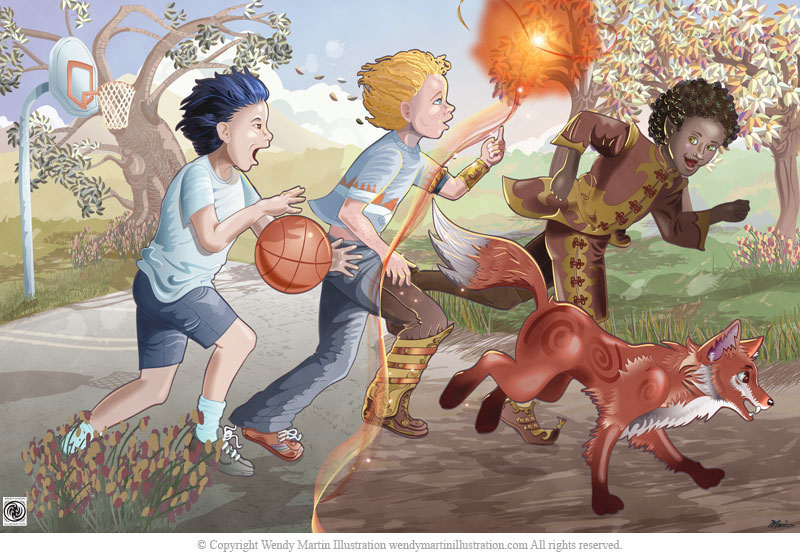
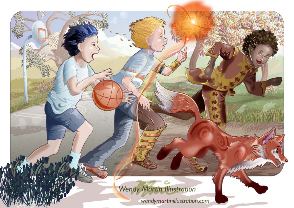
The art I created for my February 2014 promotional postcard mailer made entirely in Adobe Illustrator.
I’ve been using AI since it first came out. Sometime in the early to mid 90s, I believe. That first version of the program was installed via a couple of 3×3 floppy disks. Remember those? Not very floppy, and incredibly tiny amount of storage space. I currently use CS5, the CD for the program stores more data than my first Apple computer.
Not only has AI become a much bigger program, it now has so many more capabilities to create painterly art. Here is my illustration process in Adobe Illustrator.
I start out with paper and pencil. I may use a sketchbook, but in most cases, I just grab a piece of blank copy paper and scribble till something comes of it. Once I have a messy thumbnail down (I won’t bother sharing it, since it is unintelligible to anyone but myself) I work on character development. Characters are sketched separately, scanned in and layered into Photoshop. Adjustments and revisions are made and background options explored.
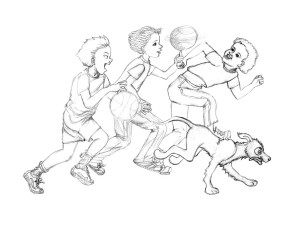
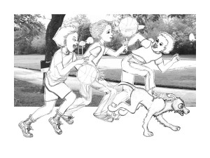

Once I have my rough layout designed in Photoshop, I bring the file into Illustrator as a template layer. I begin inking over the pencil rough. As you can see above, the inking has some major changes, especially to the right half of the image. I decided the image of the three boys and a dog playing with a couple of basketballs was too ordinary. I added more story telling to the illustration by changing the middle boy’s basketball to a swirl of light. Where the boys crossed over the division delineated by the swirl, they and their environment became a fantasy world. The dog was out-of-place, so it transformed into a fox.
I create my characters on separate layers in AI, that way I can revise them in placement, size etc, easily. The only drawback, if you can call it that, of this technique is I have to draw each character in its entirety. It’s a little more work initially, but makes the fine adjustments throughout the image creation much less of a hassle.


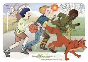
When the majority of the character inking is done, I begin adding flat color. With this piece, I had several false starts with getting the swirling light and the portal to reflect the vision in my head. Glowing orbs of light are a lot easier to accomplish in Photoshop, apparently, because I couldn’t find any reference or samples created utilizing AI. Since I didn’t want the background to compete with all that was going on with the main characters, I hadn’t inked it. I wanted to simulate a bright sunny day, but differentiate the left side from the right. I also wanted to avoid flat colors in the hills, fields and court surface, so I messed around with a variety of textures until I got the effect I was looking for. The glowing orb and separation are progressing to closer to the image in my mind. I added a larger, darker version of the background flowers to the foreground.


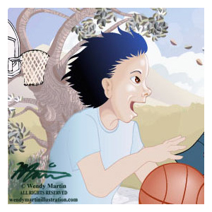
I worked the details into the left side of the background, adding leaves to the tree with flowers and grass at its roots. I decided the costuming on the boys was too similar in color and values to those of the background. I changed them so the boys appeared to jump forward in the space. The glowing orb and its trailing light has finally come close to what I was aiming for. I began laying in the fur on the fox to make it more dimensional. Then I moved to the boy on the left and concentrated on the highlights and shadows on him, his clothing and the basketball he’s dribbling.
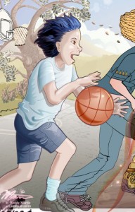
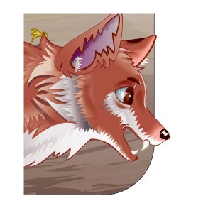
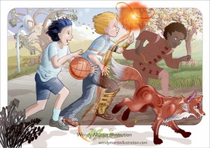
I worked on the boy and then moved over to the fox bring dimensionality and a painterly feel to both of these characters. Then I completed the background on the right side, adding the trees, leaves, flowers and grasses along with their shadows. The color and shading were also added to the basketball hoop. Shading and highlighting of the middle boy was also attacked, paying special attention to the cross-over details on his clothing to differentiate the mundane from the magical worlds he was straddling. The lighting on this was tricky since he is split by the trailing light of the glowing orb.

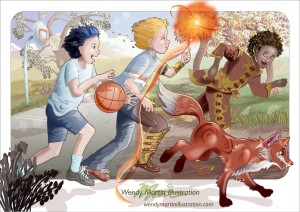
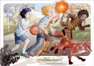
More details were added to the fox before I moved on to the last boy. As I was working, I noticed all the boys’ legs were in the same position. I didn’t like the way the elf shoes were hitting the fox, so I revised the boy’s lower half to add more variety to the children and remove the confusion between the elf shoes and fox. Once the revisions were made, I continued adding details to the woodland elf costume. It’s hard to tell here, but the elf-child has leaves scattered in his hair as well. I also decided the style of middle boy’s hand didn’t match the rest of the image, so I made it more realistic and changed its position.

While I was adding final details, I decided the two boys on the left needed to have their faces revised. Although the adjustments are minor, they gave the boys more definition and made their faces more in keeping with the semi-realistic style of the image. Almost done but for a few more minor revisions.
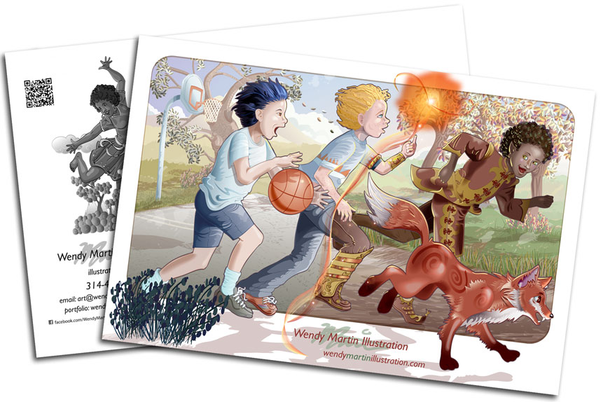
Here is the printed piece back from the printer and ready to mail out.
 To see the completed image or order prints visit my portfolio.

 RSS - Posts
Wendy,
Thanks for sharing how you made your postcard. I’ve learned a lot about Illustrator from taking your class and want to thank you for doing this class. The more I get into working with illustrator, the more I see it’s almost infinite possibilities, and probably things I won’t stumble upon except by working more in it all the time. I still like to do the ‘free-hand’ watercolors, but when I inked my last watercolor a couple days ago, I’m glad I took a good photo of it BEFORE inking. I think I made some ‘over inking’ spots, and now I’ll pull up the ‘almost finished’ watercolor, without the final ‘hand’ inking, and re-ink it using the brushes in illustrator. When I’m done, I’ll post these on my site and facebook too, and you can see what you think also. Thanks again for all you’ve done for us in these past six weeks.
It was a pleasure having you in the class. Good luck moving forward with your vectoring!