It promo time again. This time I’m making a Turtle Tower promotional postcard. I aim to send out a promotional postcard every quarter. This year, with all the work I did on “The Story Circle,” I haven’t sent out a card since early in the year. Bad, bad artist. In my defense, I’ve been frantically busy.
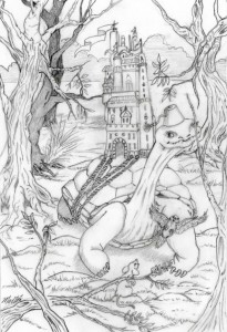
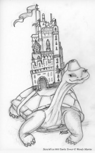 As always, the image starts as a rough sketch.
While I liked the concept of the sketch well enough, I felt it was lacking in a story line and character interaction. Think, think, think.
Same turtle image for the promotional postcard, but a lot more story. I’m still not happy with it. The castle looks like it might slip off and the bird and tree are cutting off the turtle in odd places.
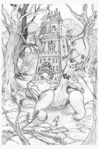 3.2 revisions later, I think I found the look I want for this promotional postcard.
The castle now grows from the turtle’s back and the birds are above his head, the branch no longer pokes him in the eye. However, it still seems like that little extra punch is missing.
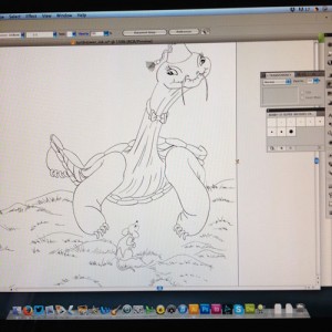
I decide to make any additions or changes while inking. I import the pencil tight sketch into Adobe Illustrator. Let the inking commence!
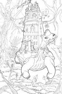
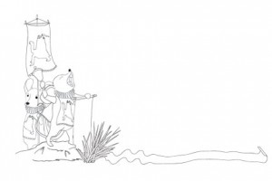
The inking went a bit faster on this piece than on the Rose Sisters, probably because I didn’t do an intricate border with ornamentation. I usually include a black and white companion piece on the address side of each promotional postcard. I decided to extend the story line on this with the mice of the castle making a proclamation.
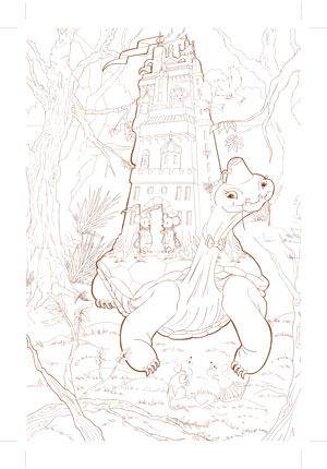
I’m coloring these traditionally in watercolor so the next step is to colorize the line-work and bring it into Photoshop to print out on 140lb cold press watercolor paper. I chose a line color that will be close in hue to the final image overall, while being light enough in value to blend in to the paint, yet not so light that it disappears with the initial washes. The color for the left image – which will be full-color – is a sepia tone leaning toward green. For the mice on the right, which is to be in gray-scale, I tinted the line work along the blue-gray spectrum. I’ve found my printer ink tends to bleed when wet if the color has any of the red/magenta inks in it. (The PIXMA has 8 color tanks.) I let the printed paper dry overnight to be sure there is minimal bleed when I paint.
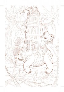
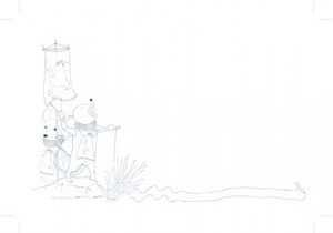 You can see the crop marks I included for scanning back in later. I will paint over the edges to make sure I have bleed for the final postcards. These images are printed out at about 225% of final size. I find this size is big enough for me to work and when reduced to postcard size, allows the details to remain sharp.
I’m ready to start color. I probably do the gray-scale side first. It’s less detailed, so I can finish faster and get that dose of happy from a task completed. But, I have to put this aside for now since the Rose Sisters piece has a deadline soon.

 RSS - Posts